


Abstract
The clinical accuracy of diagnostic tests commonly is assessed by ROC analysis. ROC plots, however, do not directly incorporate the effect of prevalence or the value of the possible test outcomes on test performance, which are two important factors in the practical utility of a diagnostic test. We describe a new graphical method, referred to as a prevalence-value-accuracy (PVA) plot analysis, which includes, in addition to accuracy, the effect of prevalence and the cost of misclassifications (false positives and false negatives) in the comparison of diagnostic test performance. PVA plots are contour plots that display the minimum cost attributable to misclassifications (z-axis) at various optimum decision thresholds over a range of possible values for prevalence (x-axis) and the unit cost ratio (UCR; y-axis), which is an index of the cost of a false-positive vs a false-negative test result. Another index based on the cost of misclassifications can be derived from PVA plots for the quantitative comparison of test performance. Depending on the region of the PVA plot that is used to calculate the misclassification cost index, it can potentially lead to a different interpretation than the ROC area index on the relative value of different tests. A PVA-threshold plot, which is a variation of a PVA plot, is also described for readily identifying the optimum decision threshold at any given prevalence and UCR. In summary, the advantages of PVA plot analysis are the following: (a) it directly incorporates the effect of prevalence and misclassification costs in the analysis of test performance; (b) it yields a quantitative index based on the costs of misclassifications for comparing diagnostic tests; (c) it provides a way to restrict the comparison of diagnostic test performance to a clinically relevant range of prevalence and UCR; and (d) it can be used to directly identify an optimum decision threshold based on prevalence and misclassification costs.
Diagnostic tests usually are evaluated by an analysis of their clinical accuracy (1). Clinical accuracy, also called diagnostic accuracy, refers to how well a test can discriminate between alternative states of health and is typically assessed by ROC analysis (2)(3). ROC plots display the specificity and the sensitivity of a test for each possible decision threshold value, which is the test value that is used as a cutoff to differentiate between two different states of health. The ROC plot itself is a measure of inherent test performance and is not directly affected by factors related to the practical use of a test, such as the prevalence of disease and the costs or benefits associated with the four possible test outcomes (true positives, true negatives, false positives, and false negatives).
In contrast to clinical accuracy, the clinical efficacy of a test refers to the practical value or the utility of a test for a particular clinical situation (4)(5). There are many factors that can impact on the clinical efficacy of a diagnostic test but not affect its clinical accuracy. For example, a highly accurate test that is otherwise invasive, expensive, or not widely available might not be practically useful and would, therefore, be considered as having low clinical efficacy. Two readily quantifiable factors that have a large effect on clinical efficacy, but not on clinical accuracy, are prevalence and the cost of misclassifications, which are the costs associated with false-positive and false-negative test results. A potentially more relevant analysis for assessing and comparing the practical utility of diagnostic tests would, therefore, include these additional factors. The effect of prevalence and misclassification costs (MCs)1 on test performance cannot be determined directly from ROC plots and requires additional computational and graphical analysis to assess the effect of these factors on test performance (4)(5).
We describe here a new method, referred to as prevalence-value-accuracy (PVA) plot analysis, for assessing and comparing diagnostic test performance. In addition to accuracy, PVA plots, unlike ROC plots, directly incorporate the effect of prevalence and MCs on test performance. PVA plots are produced by identifying the decision thresholds that yield the lowest overall cost from misclassifications for a range of possible values for prevalence and unit costs associated with false-positive and false-negative test results. As an example, PVA plot analysis is used to compare the utility of total serum cholesterol vs the apolipoprotein B to A-I serum ratio (apoB/A) for predicting coronary artery disease.
Materials and Methods
Data for the PVA plot analysis of the total-cholesterol test and the apoB/A test were obtained from a previous study on the accuracy of various lipid and lipoprotein assays for predicting the presence of coronary artery disease (6)(7). The study was performed on 394 subjects, and coronary artery angiography was used as the definitive test. All calculations and graphics6 were performed using an Apple Power Macintosh computer with ExcelTM software (Microsoft). The areas under the ROC plots were calculated using RulemakerTM (Digital Medicine). ROC plots were fitted according to a method described previously (8), and the fitted data were used for the PVA plot analysis. The volume of the PVA plot was calculated by determining the volumes of the prismatoid and the underlying rectangle under the cost surface for each unit square indicated on the x-axis and y-axis of the PVA plot.
Results
comparison of test performance by roc plot analysis
Two ROC plots, one for total serum cholesterol and the other for the apoB/A ratio, for predicting the presence of coronary artery disease are shown in Fig. 1 . On the basis of the overall shape of the two ROC plots, the apoB/A test appears to be the superior test. The ROC curve for the apoB/A test lies above and to the left of the curve for the total-cholesterol test and, therefore, has higher sensitivity at all levels of specificity than does the total-cholesterol test. This is evident as well by the area under the plot, which is a quantitative index of test performance (9). The area under the ROC plot for the apoB/A test is 0.70 and is greater than the area of 0.55 for the total-cholesterol test. On the basis of these commonly used criteria for comparing diagnostic tests, the apoB/A test would be considered to be more clinically accurate than the total-cholesterol test. The comparison of the clinical accuracy of two tests by ROC plot analysis does not, however, necessarily indicate which test is more practically useful or, in other words, which test has higher clinical efficacy.
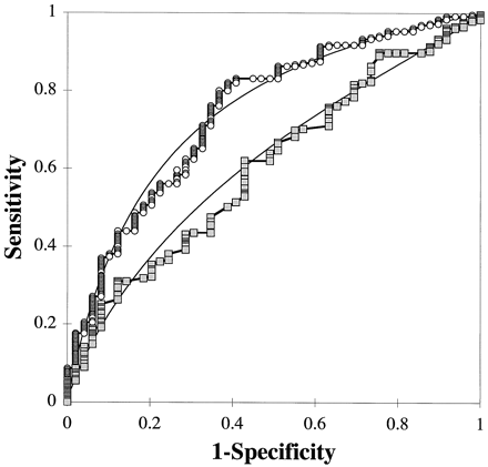
ROC plots of the apoB/A test (○) and the total-cholesterol test () for predicting coronary artery disease.
Solid lines indicate fitted curves for each test.
calculation of pva plot variables
The five variables on the left side of Fig. 2 are the input variables for PVA plot analysis. The remaining steps in Fig. 2 illustrates how the input variables were simplified and transformed, using Eqs. 1–4, to calculate the variables for PVA plot analysis. The prevalence, sensitivity, and specificity are included in the analysis by the use of Eqs. 1 and 2 (step A). These three variables are converted into a false-positive fraction (FPF, Eq. 1) and a false-negative fraction (FNF, Eq. 2). The FPF is defined as the fraction of all tests performed that yield a false-positive test result. Similarly, the FNF is the fraction of all test results that yield a false-negative test result. The FPF and FNF are related to the corresponding false-positive and false-negative values from the ROC plot, but have been adjusted for prevalence (Eqs. 1 and 2). The term “prevalence” in Eqs. 1 and 2 represents the pre-test probability of disease, which may differ from the prevalence of the disease in the population, based on other independent laboratory tests or clinical findings that either increase or decrease the likelihood of disease. The other two potential fractional test outcomes, the true-positive fraction and the true-negative fraction, are inversely related to the misclassified test outcomes and, therefore, are not necessary to include in the analysis if PVA plots are used only for comparing tests.
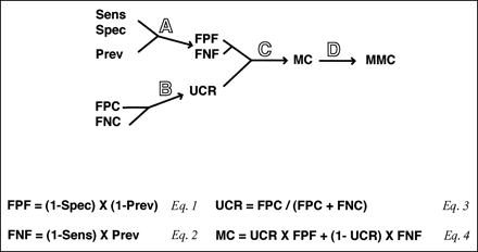
Diagram and equations describing how the variables for PVA plots are defined and calculated.
Sens, sensitivity; Spec, specificity; Prev, prevalence; FPC, false-positive cost; FNC, false-negative cost.
False-positive costs and false-negative costs, which are the unit costs associated with an individual false-positive or false-negative test result, are the other two input variables (Fig. 2). A further simplification can be made (step B) by combining the false-positive costs and the false-negative costs into the unit cost ratio (UCR; Eq. 3), which avoids the necessity for assigning absolute costs for false-positive and false-negative test results. The UCR represents the fractional cost of false-positive test results, whereas (1 − UCR) represents the fractional cost of false-negative test results.
Eq. 4 in Fig. 2 shows how the FPF, FNF, and UCR are used to calculate the MC (step C). The MC represents the sum of the relative costs associated with false-positive and false-negative test results. The (UCR × FPF) term in Eq. 4 represents the cost associated with false positives, and the [(1 − UCR) × FNF] term represents the cost associated with false negatives. Each possible threshold on the ROC plot, which is defined by a given sensitivity and specificity, would have a different MC value. Furthermore, as can be observed from Eqs. 1–4, the MC value for each threshold on the ROC plot will change as the prevalence and the UCR are changed. In step D of Fig. 2 , a further simplification is made by identifying the minimum MC (MMC) for a particular prevalence and UCR. The MMC is the lowest cost attributable to misclassifications and is associated with the optimum decision threshold on the ROC plot for a particular prevalence and UCR.
comparison of test performance by pva plot analysis
A three-dimensional PVA plot for the apoB/A test is shown in Fig. 3 A. Three variables are displayed on the PVA plot: prevalence (x-axis), UCR (y-axis), and MMC (z-axis). Only the values at the intersection of the grid lines on the three-dimensional plot are calculated, and intermediate values are estimated by linear interpolation. The results shown in Fig. 3 were calculated from 100 points on the fitted ROC curve (Fig. 1), which were chosen at intervals of 0.01 of specificity on the x-axis of the ROC plot.
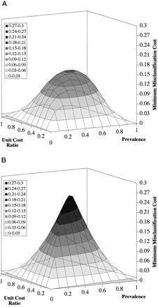
Three-dimensional PVA plot for the apoB/A test (A) and the chance test (B).
One hundred points from the fitted ROC curve in Fig. 1 at intervals of 0.01 specificity were used in the calculations.
For each possible pair of prevalence and UCR values (121 points) corresponding to the intersection of the grid lines in Fig. 3 , Eq. 4 in Fig. 2 was used to compute the MC for all 100 thresholds on the fitted ROC curve. From the total of 12 100 calculated MC values, 121 MMC values were identified and plotted on the z-axis. The cost surface described by the three-dimensional PVA plot, therefore, represents the universe of the lowest relative costs attributable to misclassifications at various decision thresholds that were optimized for a particular prevalence and UCR. Any particular point on the cost surface represents the lowest MC for a given prevalence and UCR and is associated with the optimum point on the ROC curve.
The cost surface for a useless test that cannot differentiate between a disease and non-disease state better than by chance (chance test) is shown in Fig. 3B . This plot represents the worst case or the upper possible limit of MCs for a test. The maximum value for the MMC on the chance test is 0.25 and occurs at a prevalence of 0.5 and a UCR of 0.5. In contrast, a perfect test that produces no misclassifications and, therefore, has no associated MCs would have a MMC value equal to 0.0 throughout the plot and would be represented by the two-dimensional plane created by the x- and y-axes. As can be seen by the apoB/A test in Fig. 3A , the cost surface for most diagnostic tests will lie somewhere between the cost surface of the chance test and the perfect test.
Instead of a three-dimensional plot, the same data in Fig. 3 are plotted as a contour plot in Fig. 4 , which enables the visual inspection of the entire plot in just two dimensions. The contour gray scale, which corresponds to the z-axis of the three-dimensional plot, represents the MMC value, with the darker regions corresponding to higher costs and the lighter regions to lower costs. The same gray scale (Fig. 4D) is used throughout Figs. 4 and 5 to facilitate the comparison between the different PVA plots. Interestingly, the region of the PVA plot containing the highest costs occurs in the middle of the plot, which corresponds to prevalence and UCR values that are equal to 0.5. This occurs, as can be inferred from Eqs. 1–4 in Fig. 2 , because as the value for prevalence or UCR deviates from 0.5, the overall MC decreases. The costs from either false positives or false negatives are minimized as the prevalence or UCR deviates from 0.5 because the optimum decision threshold shifts to either more sensitive or more specific regions of the ROC plot to reduce overall MCs.
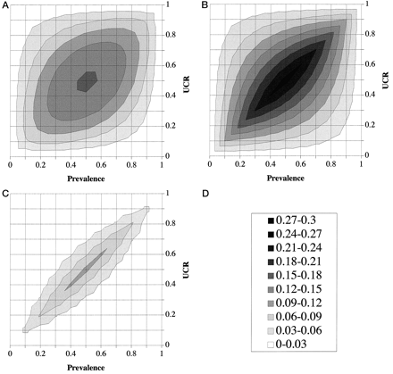
PVA plot analysis of the apoB/A test and the chance test.
(A), PVA plot of the apoB/A test; (B), PVA plot of the chance test; (C), cost-difference plot of the apoB/A test vs the chance test; (D), z-score shown as gray-scale legend.
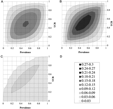
PVA plot analysis of the apoB/A test and the total-cholesterol test.
(A), PVA plot of the apoB/A test; (B), PVA plot of the total-cholesterol test; (C), cost-difference plot of the apoB/A test vs the total-cholesterol test; (D), z-score shown as gray-scale legend.
Compared with the PVA plot of the chance test (Fig. 4B), the apoB/A test (Fig. 4A) has only slightly lower costs on the four corners of the plot, but has significantly decreased costs everywhere else. To more quantitatively compare the cost difference between the apoB/A test and the chance test, we subtracted the z-values of the apoB/A test from the z-values of the chance test to produce a cost-difference plot (Fig. 4C). The cost-difference plot displays the conditions of prevalence and UCR under which the apoB/A test performs better than the chance test. The region of the cost-difference plot containing high values (see the gray scale in Fig. 4D) indicates the location on the plot for which there is a greater cost advantage of the apoB/A test over the chance test. The PVA plot of the total-cholesterol test is shown in Fig. 5B . The direct comparison between the total-cholesterol and the apoB/A test (Fig. 5A) is shown as a cost-difference plot in Fig. 5C . At all points in Fig. 5C , the costs associated with the serum cholesterol test were higher than the apoB/A ratio test, but around the periphery of the plot, particularly for conditions of low prevalence and a high UCR, the MC difference between the two tests was relatively small.
identification of optimum thresholds by roc-threshold plots
In Fig. 6 , instead of plotting MMC, we plotted the corresponding optimum decision threshold on the z-axis for the apoB/A test. This graph is referred to as a PVA-threshold (PVAT) plot and can be used to identify the optimum decision threshold based on prevalence and MCs. The PVAT plot has an overall diagonal orientation because prevalence and the UCR have an opposite effect on the value of the optimum threshold. As prevalence is increased, the optimum threshold shifts to lower, more sensitive thresholds. An increase in prevalence without a change in the value of the threshold would otherwise increase the number of false-negative diagnoses. The compensatory leftward shift of the threshold to lower, more sensitive values reduces the number of false-negative diagnoses, which minimizes the overall MCs. Alternatively, when the UCR is increased because of higher costs for false-positive diagnoses than for false-negative diagnoses, the optimum threshold is shifted to higher, more specific thresholds. The compensatory rightward shift of the threshold in this case minimizes the overall MCs by reducing the cost associated with false-positive diagnoses. Because the axes for prevalence and the UCR are positioned perpendicular to each other in the PVAT plot (Fig. 4), the combined effect of these two variables produces the overall diagonal orientation of the plot. The PVAT plot illustrates how the optimum decision threshold is varied as the prevalence and UCR are changed to maintain the lowest MC.
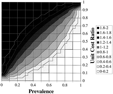
PVAT plot of the apoB/A test.
Contour levels for 10 possible ranges for the decision threshold of the apoB/A ratio are shown, using the indicated z-scale.
cost-volume index of pva plots
Analogous to the area index of a ROC plot, an index of test performance from a PVA plot can be determined by calculating the volume under the test surface (Fig. 3), which is referred to as the cost-volume index. The cost-volume index of a PVA plot provides a measure of the relative MCs associated with a diagnostic test. A perfect test would have no MCs, would have a z-value of 0.0 throughout the plot, and would, therefore, have a total volume of 0.0. The maximum volume that a test could have would be equal to the volume for the chance plot (Figs. 3B and 4B).
The ROC plots for the apoB/A test (test C), the total-cholesterol test (test E), and three hypothetical tests (tests A, B, and D) are shown in Fig. 7 A. In Fig. 7B , a normalized area index of the ROC plot and a normalized cost-volume index of the PVA plot are compared for the five tests shown in Fig. 7A . The area index and the cost-volume index were normalized to give a perfect test an index of 100 and the chance test an index of 0.0. Interestingly, the area index does not completely correspond to the cost-volume index, particularly for asymmetrically shaped ROC curves. The relative relationships among the tests on the normalized cost-volume index scale (Fig. 7B), and in some cases the rank order of the tests, are different from the ranking by the area index, which potentially can lead to different conclusions on the relative value of different tests. This is particularly true if only a partial volume (sector volume) from the PVA plot, perhaps based on a clinically relevant range of prevalence and UCR, is used to calculate the cost-volume index. For example, in sector 2 (prevalence, 0.4–0.6; UCR, 0.4–0.6) of the PVA plot, test D is ranked second in terms of the cost-volume index, whereas it ranks fourth in the area index. In sector 3 (prevalence, 0.7–0.9; UCR, 0.2–0.4), the differences in the cost-volume indices among all of the tests are relatively small.
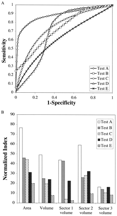
Cost-volume index of PVA plots.
(A), ROC plots for the apoB/A test (Test C), total-cholesterol test (Test E), and three hypothetical tests (Tests A, B, and D) are shown. (B), comparison of the normalized ROC area index and the normalized PVA cost-volume index for the tests shown in A. Sector volume was calculated for the following prevalence and UCR ranges: sector 1 (prevalence, 0–0.2; UCR, 0.7–0.9), sector 2 (prevalence, 0.4–0.6; UCR, 0.4–0.6), and sector 3 (prevalence, 0.7–0.9; UCR, 0.2–0.4).
The discordance between the area and the cost-volume index occurs because the area index is a global measure of the ROC curve and all the possible points or thresholds on the ROC plot contribute equally to the area index. In contrast, only the optimum thresholds on the ROC plot that yield the minimum cost for misclassifications (MMC) contribute to the volume calculation of a PVA plot. As can be seen from the PVAT plot for the apoB/A test (Fig. 6), the individual decision thresholds are not used equally throughout the PVA plot and, therefore, do not impact equally on the cost-volume index. When the cost-volume index is calculated from only a clinically relevant part or sector of the PVA plot, there are a smaller number of optimum decision thresholds that contribute to the calculation of the cost-volume index, which potentially can lead to even greater discrepancies between the cost-volume index and the ROC area index.
Discussion
ROC plot analysis is one of the most common and useful ways to examine the clinical accuracy of diagnostic tests. ROC plots, however, do not directly incorporate the effect of prevalence and MCs on test performance. The intrinsic test information (sensitivity and specificity) of the PVA plot is the same as for the ROC plot, but this information is transformed by PVA plots in such a way that the effect of prevalence and MCs on test performance can be readily observed and quantified.
There are three principal advantages of PVA plot analysis. The first advantage is that PVA plots display the exact conditions of prevalence and UCR for which one test is superior to another. For example, although the apoB/A test is better overall than the total-cholesterol test, it is evident from the cost-difference plot (Fig. 5C) that for some values of prevalence and UCR, the advantage of the apoB/A test over the total-cholesterol test is relatively small. In situations in which there is no clear advantage in the MCs for one test over another, other practical factors, such as the cost of performing the test, should also be considered to determine which test to use. A sense of the importance of any difference in the cost-index scale can be obtained by using the normalized scale shown in Fig. 7 . One could also perform PVA analysis on the confidence interval surrounding a ROC curve to determine whether any cost difference between two ROC curves is statistically different.
The second advantage of PVA plot analysis is that it provides a way to readily identify the optimum threshold for discriminating between a disease and a non-disease state at any given prevalence and UCR. By plotting a tangent to a ROC curve, one can also identify the optimum decision threshold at a particular prevalence and MCs (2)(3). In addition, methods for scaling ROC curves based on prevalence and MCs have been described for identifying the optimum decision threshold (10). These methods, however, can be difficult to perform accurately if the ROC curve is not smooth and must be repeated for each condition of prevalence and UCR tested. More importantly, because the pre-test prevalence of a disease and the UCR cannot always be defined precisely and can often vary depending on the clinical circumstance, it would be desirable to identify the optimum threshold for a range of possible values for prevalence and the UCR. As can be seen in Fig. 6 , the optimum decision threshold can be identified quickly and directly from a PVAT plot for any desired range of prevalence and UCR.
Depending on the clinical circumstance for which a test is used, the optimum value for the UCR and, in particular, the value for prevalence can change. For example, if a test is used for screening for a disease, a lower prevalence and a lower UCR would more likely be optimum. If the same test is used for confirming a diagnoses, then a higher prevalence (pre-test probability) and a higher UCR would more often be suitable. A false-positive confirmatory test may lead to inappropriate therapy, which may be costly not only in terms of the cost of the inappropriate treatment, but also because of the consequences of not treating the disease that was misdiagnosed. In the case of a false-positive screening test result, it is more likely to be rectified in a less costly manner by subsequent alternative laboratory tests. Because of the typically higher false-positive costs for a confirmatory test, the UCR would typically be higher (Eq. 3 in Fig. 2).
The third advantage of PVA plot analysis is that the cost-volume index provides a more intuitive measure than the area index of a ROC plot for comparing tests. The area under the ROC plot provides a way to quantitatively compare tests, but it does not have any operational meaning in terms of how a diagnostic test is used; it has also been criticized on the basis of its utility for comparing diagnostic tests (10). In contrast, the cost-volume index of the PVA plot can be defined operationally as a measure of the cost of misclassifications for a test. Furthermore, in contrast to the area index, once a clinically relevant range for the prevalence and UCR is known, a partial cost-volume index can be readily calculated from the PVA plot. As shown in Fig. 7 , the area index of a ROC plot might lead to choosing one test over another that is not necessarily significantly better when prevalence and the UCR are considered. This is because the area index is a global index, whereas the cost-volume index is weighted on the basis of the optimum thresholds that yield the MMCs and can be further restricted to just a clinically relevant range of values for prevalence and the UCR.
In summary, PVA plot analysis is a new graphical and analytical technique for comparing test performance. PVA plot analysis can be performed readily and quickly on a personal computer, using widely available database software. PVA plots, however, are best viewed as complimentary to ROC plot analysis and should be produced following ROC plot analysis. Unlike ROC plots, PVA plots do not display sensitivity and specificity, which are important and well-recognized factors for describing test performance. It is also necessary to first calculate the sensitivity and specificity pairs of the ROC plot to perform the calculations for making a PVA plot. Another limitation of PVA plots is that they can be used to graphically compare only two tests at a time, although one can compare the cost-volume index of more than two tests. The subsequent analysis of diagnostic tests by PVA plots, however, is useful because it enhances the graphical evaluation of test performance, by including additional factors that are not in ROC plots.
National Institutes of Health, 1 Clinical Center, Clinical Pathology Department, 2 Center for Information Technology, 3 National Eye Institute, and 4 National Heart, Lung and Blood Institute, Bethesda, MD 20892.
Nonstandard abbreviations: MC, misclassification cost; PVA, prevalence-value-accuracy; apoB/A, ratio of serum apolipoprotein B to A-I; FPF, false-positive fraction; FNF, false-negative fraction; UCR, unit cost ratio; MMC, minimum MC; and PVAT, PVA-threshold.
References
Hanley JA. Receiver operating characteristic (ROC) methodology: the state of the art.
Zweig MH, Ashwood ER, Galen RS, Plous RH, Robinowitz M.
Finkelstein SN, Kristein MM. The consequences of false-positive and false-negative errors in medical diagnosis. Benson ES Connelly DP Burke MD eds.
